Nellie"s Needles

Thursday, November 29, 2007

Pay It Forward Art Gifts

I've received a PIF art gift from Shirley Goodwin in New Zealand.
This beautiful bag created with her hand-dyed fabric and quilted with a leaf pattern measures 9"x 7". I looooove it!

It was a big surprise to get a package from my first PIF recipient, Amy Munson. I guess this would be called a PIB (Pay It Back) gift.
This lovely card of felted and embroidered flowers is 2 1/2"x 3 1/2". It is one of several she's recently made and posted about on her blog.

The notecard that accompanied it features a picture of a portion of a wonderful crazy quilt with lots of beading made by Amy.
That quilt was awarded 1st place in the Capital Quiltfest Show in Bismark, North Dakota. Go here to enjoy a presentation of close-up photos. This one of the card doesn't do it justice.

I'm soooooo pleased to receive these creative gifts of art. Thank you Shirley and Amy.

Monday, November 26, 2007

Another Prairie Flower Study

This one began as the first prairie flower study.
I had gone online to research photos and information. The foreground flowers were constructed with bits and pieces based on my findings. I kept them loose and impressionistic, but still recognizable. At this point I was most excited and pleased about this project.
I added more bits and pieces for the impression of flowers in the background along with some wool roving plus bits of yarn and thread. After layering on the tulle I quilted the foreground flowers. To my dismay they lost their "punch". So I made an additional strip of larger flowers and machine quilted it. Then I positioned the new strip of flowers over the bottom of the quilt and made a wavy cut through both layers. The edges of the strip and quilt were butted together and connected with two rows of zig-zag stitching. Additional quilting lines of grasses secured the seam.
At this point, it had become a lot of work and I wasn't feeling too happy with it. That's when I decided to make a small study in the style of my lake pieces. Now, that was FUN and I very much liked the result. So, I made another one. Both are featured here.

Back to work on the larger study. I finished the machine quilting. It looked static and I was thinking about starting over. However, there was a deadline. These studies had to be in the mail for a client presentation and there was no time to begin anew. Just before I fell asleep that night, it occurred to me to cut it up and rearrange the pieces. The next morning I printed several copies of the above picture. Each was cut into 5 vertical strips. I played with varying arrangements and settled on this one.

Prairies Flowers I - 28"x 29"

Yeah, it worked! Fracturing the picture improved the dynamics greatly. I'm pleased with the flow of the foreground flowers ... they seem to be swaying in a gentle breeze. A wide zig-zag stitch holds the panels together. A hand-dyed flat rayon yarn is couched over the seam.

On the back the seams and outside edges are concealed and at the same time secured with flat tubes of fabric. The shaped top and bottom have interfacing and are lined with the backing fabric.
A flat metal bar was cut to size and sewn into the sleeve. I adhered Duck tape to the cut ends so as not to damage the quilt.
Before attaching the sleeve I marked the appropriate corresponding holes for hanging. A buttonhole stitch attaches a metal ring around the hole cut in the fabric sleeve.
My solution to the problems in this piece has led to the proposed configuration of a very large wall piece. I could construct it in banner style pieces of up to 12 inches wide. Whereas, a one-piece construction style would limit what I can physically handle. A large piece could even have each panel finished separately and hung individually side-by-side. Then there would actually be a slight swaying movement to the flowers ... and grasses ... and clouds.

WOO HOO!!! The clients were pleased and there will be a commission. They even purchased the three studies.

Sunday, November 25, 2007

Prairie Flowers

Instead of lake pieces here are two of prairie flowers constructed in the same "ortwork" technique.

Summer Prairie Flowers - 13"x 11"

Spring Prairie Flowers - 13"x 11"

These are two of three studies I have made in preparation for a possible commission project. Between getting settled back here in Tennessee and working on this project there's been no time to add to my 100 Lake series. Number 51 was the last. I most likely won't have the time or space to create more until after the new year.

More is to come about this prairie flower project.

Thursday, November 22, 2007

Happy Thanksgiving from Memphis

Wishing you a happy day from my "turkey" with his singing Elvis lobster.
He's already visited Graceland to shop for more stuff(ing) for the Elvis Shrine Room.
I am thankful to have this Elvis fan and his quirky sense of humor in my life.

Thursday, November 15, 2007

MORE About The Lauguage of Values/Emotions

The values we use in our art is the language of emotions that triggers reactions. We each naturally respond to various combinations whether we're viewing OR choosing them for our work. Most of us create with what "feels right". That is the heart of individuality. Just as our verbal language is full of nuances depending upon the tone of our voice and words we choose, such is the combinations of values, hues, and patterns that we put together in our art.

Kay had left this comment/question on my post, "Value vs Color".

"This is a fascinating post. I've never heard the ideas about the mood created by different values before. I also have a light value quilt on my bedroom wall (with less contrast than yours) and I agree about the mood effect. I find it peaceful early in the morning. The only one of these I question is the last contrast, medium value (low contrast). Surreal and mystery fits your piece, but aren't the fabrics partly responsible for that? Would all colors create the same effect, do you think? "
She has a good point. I realize this particular piece for that study is on the edge of acceptance for the given description. My choice of fabric patterns does play a role in the surreal mood of the piece. It was the last one I had done of the six pieces because working in a limited middle value range of colors is not easy ... and by then I was DONE. Now that I've shared this theory and those pieces, I guess I'd better address that category more thoroughly.

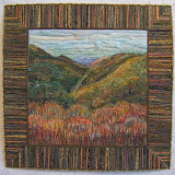
The book, Color and Fiber, includes a seventh value combination whereas I had presented six. There are two listings for the category of a weak contrast of medium/middle values. The first pertains to a limited range of values. To quote from the book, the mood conveyed by a close range of values is "atmospheric but with a quality more reminiscent of twilight or an unreal dreamlike condition. Words such as slumber, peace, fog, and calm" are descriptive. I went through my photos and came up with these examples. Lake #3 printed in black and white and in color:
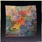

"Aquamarine" in black and white:

I had to do quite a bit of pastel work on the fish to make it stand out from the background. There's a warm/cool contrast between the colors/hues but very little contrast between their values.

The second listing for a weak contrast of medium/middle values extends the contrast to some degree in the direction of black and white. It is this extension of the range of values that suggests a feeling of fantasy, mystery, or surrealism. This is the one I had employed in the study.

Many pieces that I make with this weak contrast of middle values get lights and darks thrown into the mix.
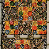
"Land of the Unicorn" - 12"x12"
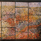
"Coming Unstrung" - 28"x24"
I added dark values, even black and white, to the framing which adds elements of a strong value contrast (strength, directness, richness, openness) to the feelings of fantasy and surrealism within these pieces. (Go here to read more about these two quilts.)

Kay's latest project is about Ghost orchids. I consider that her main choices of middle value hues extended with the addition of dark gray and lights work to give it a ghostly, surrealistic mood. Now, she didn't consciously select these values to get that feeling. However, her innate sense of the effect she desired for this rare and unusual flower led her to choose them.


Many times trouble with a color combination is a value problem.
Theories and principles are good to know when there is a problem in getting the results we're after. This knowledge gives us a direction to look for a solution.

Saturday, November 10, 2007

"Inner Spectrum"- What's In My Bedroom

Making the rounds of quite a few blogs is the question,"what's on your bed?" The usual response is a photo of a beautiful quilt on a bed. Not mine ... there's a down comforter in a plain duvet cover on my bed, BUT each morning I awaken to this quilt hanging on the wall across the room.
"Inner Spectrum" (51"x 51")
The windows of light reflect the inner self, the soul. The window frames and borders represent the protective layers and boundaries we set up to shield our fragile and private selves. Even though the subject matter is deep, it makes me feel stimulated and happy. (In reference to my previous post, that's the result of the strong value contrast with the light values dominating.)
This piece is made from plain and commercially printed fabrics that I hand painted. There is both hand and machine quilting. I whip stitched a silk thread around the quilting stitches within the window frames to accentuate those lines.
  1. Exhibitions:
  • 1999 Dogwood Arts Quilt Show - Knoxville, Tennessee awarded Honorable Mention
  • 2000 - "Patchwork Pleasures", Folk Life Museum - Farragut, Tennessee
  • 2000 - "The Millennium Art Show" - Knoxville, Tennessee
PS: There is a quilt on my bed at the cottage in the "land of OZ". Go here to view and read about it.

Sunday, November 04, 2007

VALUE versus COLOR

Quite a few years ago I came across information in the book, "Color and Fiber" that translates to:

"The first visual response is to value contrasts rather than to colors."

Colors have "local" meanings depending upon the culture (see end of this post for examples) whereas the relationship of values (lightness/darkness) is a universal language of moods to which each of us responds.

The full mooned Halloween small quilt is one of six pieces that I made up to more fully comprehend this theory. Each features the same composition. The consideration for my choosing the fabrics was according to value organizations for strong OR weak contrasts.


STRONG CONTRASTS
light values dominating = positive, stimulating, happy

medium values dominating = strong, direct, rich, open

dark values dominating = mysterious, dramatic, dignified, somber

WEAK CONTRASTS

light values = delicate, atmospheric, serene

medium values = surreal, mystery, fantasy

dark values = somber, depressed, brooding

For these reasons, understanding value and their relationships is a valuable tool for establishing the mood of a piece. Value and the expression of a pattern holds more importance for me than color. In so many situations any number of colors will work. Consequently, strange colors can creep in and create unexpected excitement.

To isolate value from color in my work, I view it through the wrong end of binoculars. This creates a faraway viewing distance which obscures the colors and patterns allowing me to more easily assess the values and their interaction and progression as well their as impact or mood.

What I've presented here is only touching the surface of this topic. My intention is to bring awareness to an important element that is often overlooked ... even though it's something we all intuitively feel. So, the next time you have a color problem or a particular mood is not being conveyed, check out your chosen values and their contrasts.

(This conversation is continued in a future post here as a result of Kay's comment at the end of this one.)


........................................................................
RED
China: Good luck, celebration, summoning

Cherokees: Success, triumph
India: Purity
South Africa: Mourning
Eastern: Worn by brides
Western:
excitement, danger, love, passion, and stop
ORANGE
Ireland: Religious (Protestants)
Western: Halloween, creativity, autumn
YELLOW
China: Nourishing Egypt: Mourning
Japan: Courage
India: Merchants
Western: Hope, hazards, coward
GREEN
China: exorcism
India: Islam
Ireland: Symbol of country

Western: Spring, St. Patrick's Day, go
BLUE
Cherokees: Defeat, trouble
Iran: Heaven, spirituality
Western: Depression, coldness, royalty, wisdom
China: Immortality
Middle East: Protection
PURPLE
Thailand: Mourning

Western: Royalty, luxury, sensuality, magic

WHITE
Eastern: Funerals
India: Unhappiness

Western: Brides, angels, peace


BLACK

China: Color for young boys

Thailand: unhappiness, evil

Western: Death, mystery,
To read more about the symbolism and psychology of color go here.